Website powered by

Paperblanks Paper-Oh and Mixed Media Sketchbook Review

Article / 15 August 2022

Paperblanks Mixed Media and Circulo Sketchbook Reviews

Paperblanks has recently released two new offerings, the Circulo notebook and sketchbook range and a mixed media paper, available in the standard Paperblanks hardcover range. I have both a Circulo and the mixed media sketchbook in an A4 size. I have been using Paperblanks for a couple decades now. I have purchased or been gifted numerous sketchbooks and journals from the company. In March 2022 my sketchbook/bullet journal was featured in the Paperblanks EndNotes blog

Paperblanks Paper-Oh Circulo Sketchbook

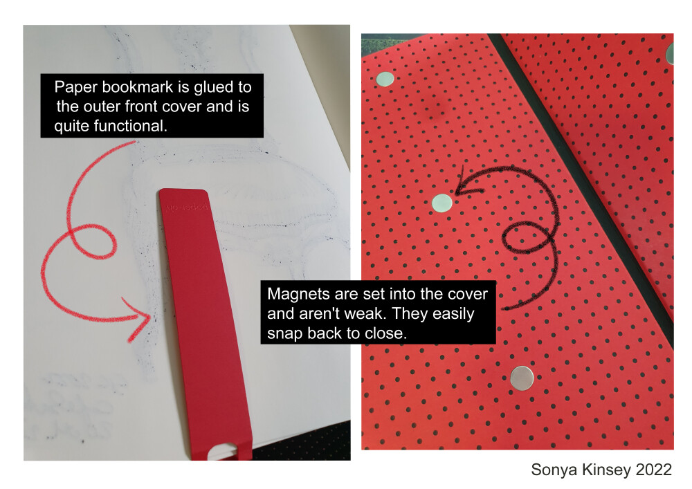
The Paperblanks Paper-Oh range was introduced in 2021. This range offers something different than the previous formats and covers of Paperblanks journals. Rather than the highly illustrated and often shiny covers that the company is known for, the Circulo line features a simple two-color dotted design. Mine is Red on Black, A4 size. There is also a fold out paper tab that you can use a bookmark. It has 128 pages with a lightweight 80 GSM paper. With this weight of paper and the paper cover, the sketchbook is very light. The Paper-Oh books have wrap around covers, with four pairs of magnetic snaps to keep the book closed. This makes the range ideal for those on the go, you can easily close the cover and not worry about the cover flopping open and the pages getting battered. I took mine out to a horse show and out to the city with me several times to sketch. Although a harder cover would provide more support, I was able to hold the sketchbook on my lap and against my leg to draw.

The paper inside is nice for sketching in graphite, coloured pencils and ink pens. However, if you work with ink, the ink will bleed through to the other side. This means you really can’t use both sides of the page. The paper is smooth, and pleasant to write on, and it handled my erasing and reworking the pencil sketches and coloured pencil just fine. I did try a harder pencil, when I started the sketch of the statue, but on the smooth paper it didn’t give me the results I wanted. The paper also photographs and scans well. It isn’t a true ‘white’ so there is a tint in the colour scan, and it was a bit difficult to get a white background.

Coloured pencils also look good on this paper. Faber-Castell Polychromos and Prismacolor Scholar pencils both applied well to the surface. Building layers and erasing was fine.

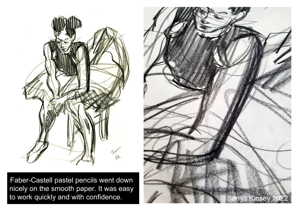
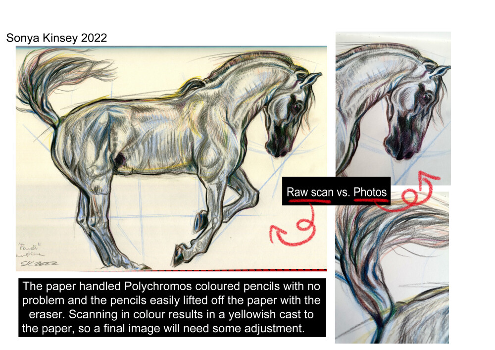
I used a Lamy pen, a Kuretake Zig Manga brush pen, Akashiya Kyoto, Kuratake Cocorio, Kuretake Fude and a Pentel brush pen on these pages and they all did very well. The chair and horse below are with my Lamy and a Pilot fountain pen ink, the ballerina is sketched with a Kuretake Zig brsh pen and a Cocorio.

I personally prefer something with a harder cover for urban sketching, but the slim design means the book fit into my narrower bags with no trouble and didn’t add a lot of weight for a day out in the city. If you’re looking for a light, slim notebook or sketchbook, with a minimalist cover, for under 10 Euros, this is a good option.

Pros: lightweight, inexpensive, smooth writing surface for pens and pencils, excellent for ink.

Cons: Some ink bleeds through so you may not get both sides of the page, thin cover may not be the best if you don’t have a surface to write on.

I wouldn't repurchase, but I think more minimalist writers and note-takers would like this line a lot. 8/10

Paperblanks Mixed Media Sketchbook

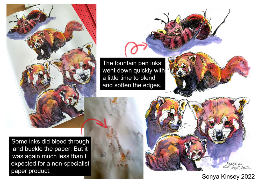
In 2022 Paperblanks released their first mixed-media paper books. I received mine as a thank you for the blog post, right after they were released. I choose the A4 or Grande size, from the Old Leather Collection. This is a solid sketchbook, with the typical robust Paperblanks cover. The cover does a good job of mimicking the look of aged, scuffed leather. The paper is 200 GSM, and the pages are perforated for easy removal. One of the things I really like about Paperblanks is how well they handle ink, even better than Moleskin, so I was very interested to try this paper. I have to say that I was not disappointed. My ink sketches and illustrations absorbed quickly, without bleeding or smearing. My Fineliners functioned perfectly and I was able to colour with fountain pen inks, alcohol art markers, and Mildliners.

I used fountain pen inks and brush for this sketch. The inks look great and there was much less bleeding than I expected for brush and ink colouring.

My Copic Sketch and Stylefile markers were very easy to use on this paper. Sif's white blouse and berry dirndle came out nice and sharp, as the strokes didn’t feather and I was able to blend several layers for shadowing. The markers also bled through the other side much less than expected, mostly where I coloured the shadows. The Kuretake Zig brush that I used for Gerd and Sif's skin tones and shadows didn’t penetrate to the back side of the page at all.

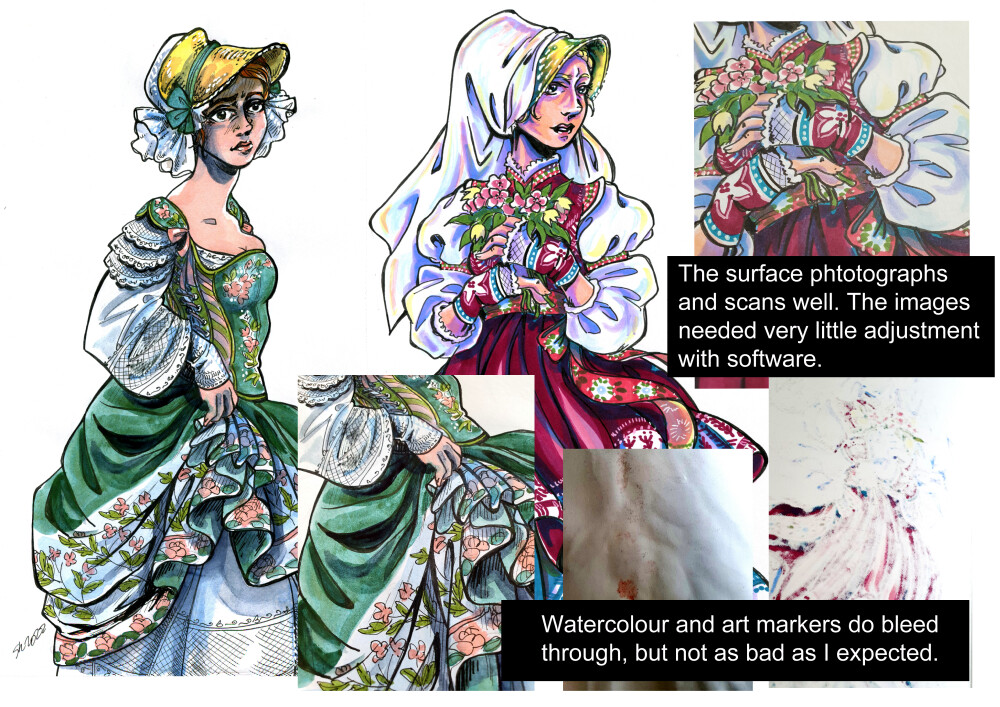
Next up was gouache and watercolour. Firstly, the paper will warp as you paint. I had to clip the page down with bulldog clips to help it dry better. This paper absorbs watercolour very quickly and I found it difficult to lift out paint once it was down. Since I usually work wet-in-et and use a lot of blotting, this was a bit frustrating for me. That being said, the paper certainly doesn’t disintegrate or just let everything through. On this sketch only the Ecoline Liquid Watercolor (the roses on Gerd's green dress) bled through more than other paints. The Schmincke watercolours (green) and W&N (the yellow and blues for the bonnet and shadows) didn’t go through.

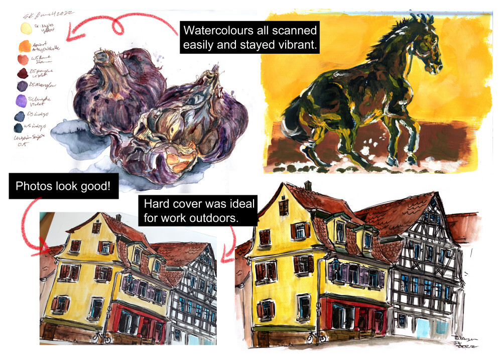
This sketch of some French garlic shows that the paper can handle wetter painting techniques and layering. The paper buckled a bit, but with two bulldog clips securing it to the rest of the paper and the back cover, the sheet dried nicely. My paints from my Sakura Koi travel kit, which have more filler and therefore don’t soak in as much, worked really well with this paper and there was very little warping.  The gouache sketch of a horse also demonstrates the papers versatility. The garlic, the horse and the houses all scanned so well, I only needed a bit of brightening and darkening in CSP to bring out the pigments and pop the white of the paper.

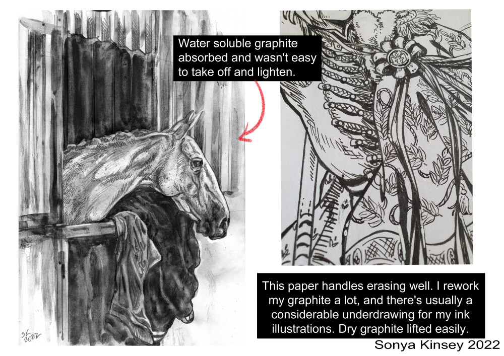
I also did some pencil sketching, with both pencil and Viarco water-soluble graphite. The paper was very nice to work with and handled my subtraction and hatching techniques with no problems. The dry graphite erased really well, and the paper's surface proved quite durable.

Overall, I was satisfied with this sketchbook. It handles dry media and ink really well. I also tried a bit of stamping and collaging with washi tape. The oil-based inks from Shachihata didn’t bleed through at all. Wet media will require a little prep. I recommend scrap paper to soak up anything too liquid and protect the next page form moisture, as well as clips to help with buckling. Watercolour sketchbooks, unless they use extremely heavy paper like 300 GSM, generally need bulldog clips, or something to hold the loose side or the corners of the sheet down to prevent warping so I don’t see this a problem. This isn’t a dedicated watercolour sketchbook so the paper won't handle painting techniques that use a lot of water. This paper also scans and photographs well, which in the age of social media, is a nice bonus. The perforation isn’t a quick tear-off, I had to be a bit careful to start to remove the page and work slowly, but it came out cleanly. 

Paperblanks uses recycled paper for the book boards, and sustainable forests for the folios. The covers are plastic, but these aren’t meant to be disposable products like other cheaper sketchbooks or notebook lines. This is definitely a sketchbook I don’t want to burn through and use up. I'll be saving it for my finished illustrations and 'good' sketches. Paperblanks isn’t a fine art brand that specifically targets professional artists, but a stationary brand that broadly targets a range of customers looking for a special notebook, journal, or planner, with thread binding and beautiful covers. I think this paper is good for hobby artists generally, and any artists working in ink or a variety of media. In my experience Paperblanks books are very durable and handle travelling well. The plastic covers means that I don’t worry about spilling ink or coffee or sticky spots on café tables. I usually take public transportation, so for me there's always a trade off between weight and bulk, and a sketchbook’s durability. Paperblanks balances these things out nicely and I'd happily get another one of these as a gift.

Pros: Durable cover and binding, archivable, excellent for ink and markers and dry media, photographs and scans well.

Cons: Higher price, paper doesn’t handle wet media consistently.

Since I’m a watercolourist, I’m going to give this paper a 9/10.


Figma Horse Action Figure Review

Article / 11 August 2021

This is a review for the second version of the Figma horse action figure. I bought mine from Total Otaku Mode last November in 2020. Thanks to shipping delays from COVID I only received him in June of 2021. I've spent the last two weeks playing with him and I have some opinions.

I'm an illustrator and comic book artist who grew up riding and working with horses on a farm. I really enjoy drawing horses and incorporating horses and equine creatures into my comics and illustration. At the time of writing this review I'm working on a book about drawing horses for comics and illustrators. I have a small collection of model horses and a photo collection that I used to bolster my personal experience. In addition to this text review on my blog I've also uploaded a YouTube video where I cover a lot of these points.  In this review I'll cover what I think are the pros and cons of this model and how I think he can best be used and provide some examples of my own work in Clip Studio Paint.


First of all, the anatomy and proportions of this model are reasonably good, although not perfect. Any horse will have some variation based on that individual animal and its breed, but this model has a few points that I think aren't really accurate, especially compared to other horse models on the market such as the Collecta, Breyer or Schleich models. These models aren't articulated but they are the same price or quite a bit cheaper, depending on the size, and generally more anatomically accurate. I feel like his head and neck are a bit too small and that his hindquarters are a bit too high. My other immediate impression was that his hind legs are a little bit too long. When he's positioned standing on all four legs, his hind legs have to be set quite far back. He has a very general look and doesn't resemble any particular breed or type of horse.

His head looks good from the side but from the front his back jaw is a little bit wide. Horses have eyes that are set out a little bit more from their skull in order to allow them nearly 360-degree vision. Some horses have proportionately wider heads, especially draft breeds, but it's a common mistake to draw a horse’s jaws as wider than his eyes and here the artist has definitely done that. From the front a horse’s eyes should make the outermost points of a diamond shape and the jaw should not be visible on either side of them. His nose is well modeled, I think his mouth looks quite good. It really does look to me like how a lot of artists draw horse heads when they aren't familiar with how horses look in life.


He doesn't really have any withers, that is the high point right at the base of his neck, but this has been covered with the articulation and the saddle, so I'm not too upset with that. His front legs look very good. Over his rump there's a weird triangular shape. It seems like the artist who modeled this thinks that there is some sort of triangular bulge like what humans have over the lumbar where the torso comes down to meet the pelvis. Horses don't have that bulge. They are smooth over the back and rump, so I find this very strange. You can see how it should look just by checking photos of horses. There is no triangular bulge over the hips and the rump so I'm not really sure where this came from.

 Like I said before his back legs seem a little bit long. They don't really sit under his body the way they should but maybe also part of the articulation. I don't make articulated models so I want to give a little leniency here. As for his articulation I think it's fine, the head doesn't move very far, just a bit from side to side and the neck can move from side to side, and a little up and down. I would have liked to have seen him be able to take his head all the way down. Sadly, no grazing for him. His front legs have good articulation and can take a very natural position. I think he could use one more joint of articulation at the femur where it connects to the patella, that is the joint where the horses leg starts to move independently of its body, right behind the groin. It's basically the horse’s knee and has a lot to do with how the horse moves his hind legs. I think it would have just allowed him to be a bit more posable but again I don't build these models, so I don't know how much space there is in the joint for a model this size. The horse does stand on his own for legs, it's a little bit tricky to get him to stand on three and he can't stand on two. He does have a base that he comes with, and it has pegs that fit into a hole on his belly and a hole under his tail. This should allow him to make more poses. The base does support him in a jumping position, but when I tried to get it in under the tail to put the horse into a rearing position the peg broke, so I don't know how successful that is in real life. He is a heavy model and to get him to do positions like jumping or rearing you'll either have to hold him and take a photo or you'll have to rely on the base. So, for poseability I would give him maybe a 7 or an 8 out of 10. I find that his mane looks alright, but this model doesn't have a really natural tail. A horse has over ten tail vertebrae, very much like a dog and their hair grows off this, so this tail doesn't look very natural at all. His mane and forelock look more natural, it kind of makes me think he has shounen at the front and shoujo hair in the back, sort of like an anime mullet.


His hooves actually look really good! I think they're modeled quite well and I like that there is a joint on the pastern bone so his hooves have more movement than just sitting at the end of the straight leg. There's a wooden articulated test artist’s model I see on Amazon or in art shops that models pasterns and hooves don't have the articulation of this one. I'm not sure what the artist was looking at! It's interesting because in the first version of this model, the musculature seems to be more smoothed out. It seems like they wanted more detail but actually it looks a little strange if you are very familiar with horses.


The second point I have is about his tack. It looks like they tried to give him a typical English hunter bridle but again, I think it's clear the artist didn't really understand how bridles work as the nose band is way too low and should go up to sit more in the dent of his nasal crest and the noseband shouldn't be directly connected to the bit. The other interesting thing about this model is the saddle in the photos of the first version is clearly an English or dressage saddle with the girth set directly behind his front legs. However, in this model the horse is wearing a different saddle and his girth is in a different position. I wasn't initially sure what kind of saddle this was meant to be but after asking in my horse art group the consensus was that this is an endurance or trail riding saddle. It should be clear that this is not a western saddle. Not only that the saddle is actually a bit too big (something else the group agreed upon) and is set too far back, the biggest problem is that the girth is now sitting over the largest part of the horse's belly! This is totally incorrect and dangerous, as from this position the girth will simply slip off forwards or backwards and the entire saddle and rider with it. The cinch always goes directly behind the horse’s front legs and I'm not sure how this mistake was made, since I'm 100% sure there are no reference photos showing a cinch or a girth in this position. The first version of this horse was more accurate there.


All in all, I think this is not a bad model, but it definitely needs to be supplemented by further studying horse anatomy and having references for equipment, if you don't already know how tack works. I'm not unhappy with the model but I'm glad I didn't pay full price for him. I think if you were only drawing horses only a little bit, he would be a bit of an extravagant purchase and you could probably just rely on photos to do your work, but if you're someone like me who draws a lot of horses or you have a project that requires a lot of horses from different poses, then I think he's quite useful, especially for taking your own reference photos. An artist can save a lot of time by being able to take their own photos from various angles rather than having to search online. I know from my own work that it can be very difficult to find certain shots of a horse, say from underneath the head or directly overhead or with extreme foreshortening, so I think he was a good purchase. I would stress that it's important to do your own studies of horses, from life ideally or from a variety of photographs so that you have a good enough knowledge of horse anatomy to work with this model and not copy the mistakes of the sculptor. I think he's a really cute addition to my herd and while I have seen and even own models with more articulation, I do really like him. Overall, I'll have to give him a seven out of 10. If he had slightly better proportions and a little bit more accurate musculature, I would give him another point. I do have to take a full point away for his tack because there's absolutely no saddle set up where the girth was on that position, unless it was a how not to saddle your horse tutorial. It's not clear to me if the sculptor was referencing photos or referencing another artwork. I think he'd be a very good purchase if you got him on sale or again if you're going to be drawing a lot of horses, and you want to be taking your own reference photos. Unfortunately, I'll have to buy another stand, but for the moment he's alright on the windowsill with the rest of my models.